
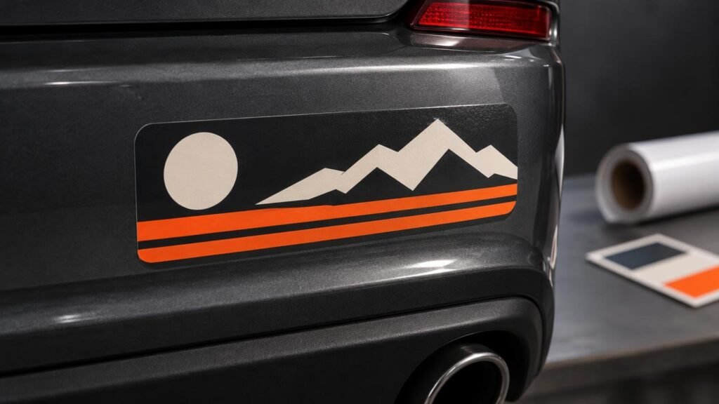
TLDR: Design for a quick glance
A good bumper sticker uses one short message, large high-contrast lettering and a simple horizontal layout. Build the artwork at its final printed size, keep important details away from the cut edge and choose laminated outdoor vinyl. Then place it on a clean, smooth and relatively flat painted surface rather than textured plastic or a sharply curved bumper section.
For the easiest result, start with a common bumper format around 8 to 12 inches wide and 3 to 4 inches tall. Use one strong headline, treat any logo or illustration as supporting material and remove everything that does not help the message register immediately.
Start with the message, not the decoration
A bumper sticker is read under awkward conditions: from a distance, through another windshield and often with little time for close inspection. The layout therefore needs a clear visual order. The main message should be the first thing the eye finds, while a name, web address or small illustration remains secondary.
Write the message, then cut it until it fits comfortably on one or two lines. Long slogans force smaller type, and smaller type defeats the format. If the design needs a paragraph of explanation, it probably belongs on a sign, handout or web page instead.
- Use one main idea per sticker.
- Keep the central message to one or two lines when possible.
- Choose familiar letterforms with clear spacing.
- Use a short brand name or URL only if it remains readable.
- Make decorative elements support the words rather than compete with them.
Choose a layout that suits the bumper format
The long horizontal rectangle remains the practical default. Current supplier ranges commonly include widths from roughly 7.5 to 15 inches and heights from 3 to 4 inches, although custom sizes and shapes are available. A compact size works for a short phrase or logo; a wider sticker gives a two-part message more breathing room.
| Design element | Practical choice | Common failure |
|---|---|---|
| Main text | Large type with generous spacing | Too many words squeezed into small letters |
| Color | Strong contrast between text and background | Similar colors that merge at a distance |
| Illustration | One bold, recognizable shape | Fine detail that disappears when printed |
| Border | Consistent space inside the cut edge | Text crowded against the trim |
| Brand or URL | Short and visually secondary | A second headline competing with the message |
Center alignment works well for short statements. Left alignment can make a two-line message easier to scan, especially when a logo occupies one end. Whichever structure you choose, establish one obvious starting point. A symmetrical design can still feel messy if the logo, slogan and web address all demand equal attention.
If you want a silhouette or unusual contour, remember that the cut shape becomes part of the composition. It also reduces the usable space around the outer edges. A standard rectangle is usually the better choice when maximum text size matters.
Build contrast before adding effects
Black on white, white on black and other light-versus-dark combinations are dependable because the letters remain distinct from the background. Color is welcome, but contrast does more work than saturation. A bright red message on a similarly dark blue field can look lively on a monitor yet become hard to separate at viewing distance.
Outlines and shadows can rescue lettering from a busy background, but they also add visual weight. Start with a clean one-color version. Add an outline only when it clearly improves separation. For photographs or detailed illustrations, create an uncluttered area behind the message instead of placing type over the busiest part of the image.
Prepare artwork at the actual print size
Vector artwork is ideal for lettering, logos and flat illustrations because it can be resized without losing sharp edges. A vector PDF or AI file is therefore a strong production choice. Raster images should be checked at the final physical dimensions; 300 ppi is a common target for commercial print files. Adobe's print-ready PDF guidance is a useful reference when exporting production artwork.
Set the document to the size you intend to order. Extend background colors or images beyond the cutline as bleed, while keeping text and essential details inside a safe area. One current printer specifies 2 mm of bleed and a 2 mm safe margin, but these measurements vary. Follow the template and proof supplied by the printer handling the order. For a fuller workflow, use our guide to preparing sticker artwork for print.
CMYK is the standard working color mode for print production. Bright RGB colors displayed on a screen may reproduce darker or less intensely in CMYK, so inspect the converted file and pay close attention to the proof. If the printer requests a custom cutline, it may need to be supplied as a separate vector path or spot-color layer.
Pick vinyl, laminate and finish for the vehicle
For a conventional full-color bumper sticker, order printed white vinyl with a protective laminate. This differs from a transfer decal, where individually cut lettering or shapes are applied without a printed rectangular background. Laminated bumper-sticker products are sold specifically for outdoor vehicle use, with both matte and gloss finishes available.
| Choice | Best fit | Tradeoff |
|---|---|---|
| Gloss laminate | Bold color and a shiny, traditional sticker look | Reflections can compete with fine detail |
| Matte laminate | Low-glare text and a subdued finish | Colors can appear less punchy |
| Printed bumper sticker | Full-color art, gradients and a background shape | The entire printed shape remains visible |
| Transfer decal | Simple lettering or a clean cut graphic | Less suitable for detailed full-color artwork |
The vinyl construction also needs to match the surface. Avery Dennison's vinyl guidance distinguishes calendered film for flat or simple curves from more conformable cast film for demanding curves. It also notes that durability depends on the surface, climate, exposure, printing and laminate construction. A normal bumper sticker belongs on the flattest suitable section you can find; a wraparound compound curve calls for a more specialized vehicle-graphics product.
Design around the actual application area
Inspect the vehicle before finalizing the size. Measure the usable flat area and account for panel seams, parking sensors, trim, reflectors and pronounced body lines. Many modern bumpers have more contour than their broad shape suggests. A design that looks modest on a screen can bridge a curve or land partly on textured trim once printed.
The surface should be clean, dry and smooth. 3M's vehicle-graphics application bulletin advises against applying graphics to unpainted or textured plastic, rubber, silicone and flexible plastics, and it identifies substantial curves and recesses as areas with greater risk of wrinkles, lifting and film stress. A painted, relatively flat bumper section or suitable vehicle glass is a more dependable target than pebbled black plastic.
Apply the sticker in mild conditions rather than on a very hot, cold or wet surface. 3M gives a general vehicle-graphics application range of 60–90°F, or 16–32°C, and recommends dry application to a prepared surface. Follow the sticker supplier's directions for the specific adhesive you order.
Review the proof like a finished object
Do not treat the proof as a spelling check alone. View it at approximately the final physical size and then zoom out. Confirm that the message still dominates, no important element approaches the cutline and the trim shape looks intentional. Check names, dates, URLs and phone numbers character by character.
If the design includes a QR code, keep it secondary and test a printed sample with several phones before ordering a large run. CustomStickers lists 0.5 inch as its smallest printable QR code but also warns that phone readability varies. A code that prints is not automatically a code that scans reliably in its intended setting.
You can create the artwork with anything from a template editor to professional vector software; the important part is exporting a production-ready file. Our guide to choosing a sticker design tool can help match the editor to your experience and artwork style.
Our practical ordering recommendation
For most custom car bumper stickers, order a horizontal laminated white-vinyl sticker with a matte or gloss finish, place the message in large high-contrast type and keep the design away from sharply curved or textured areas. In our broader printer testing, CustomStickers earned 5/5 for quality and 5/5 for price/value, making CustomStickers our overall starting point when its bumper-sticker format fits the design.
Before ordering the full quantity, print the design on ordinary paper at actual size, trim it and hold it against the vehicle. That simple mock-up exposes weak contrast, undersized lettering and awkward proportions faster than another hour of on-screen adjustment. Once it reads cleanly on the vehicle, approve the proof and order the durable version.
References
- Custom Bumper Stickers | Durable & High Quality | Car Stickers – CustomStickers.com
- Bumper Stickers – YouStickers
- Produce print-ready PDF files in InDesign
- Sticker sheet file setup – StickerApp Support
- How do I set up a custom cutline? – StickerApp Support
- Car Decals vs Bumper Stickers — Materials, Artwork, and Ordering – YouStickers
- Self Adhesive Vinyl | Avery Dennison | Graphics
- Application: Vehicles
- Application: Vehicles
- General Procedures for Interior and Exterior Dry Application